Karori Kitchen #2
Karori Kitchen #2
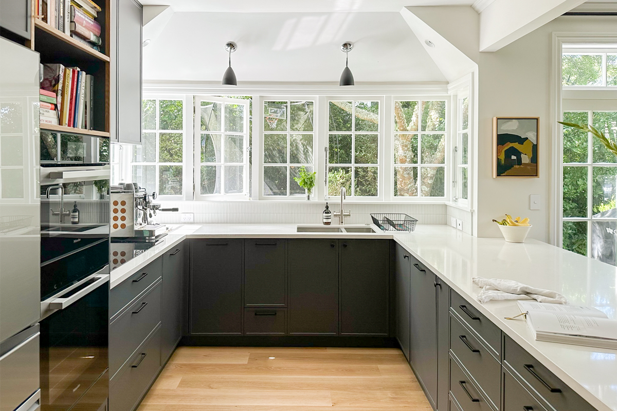
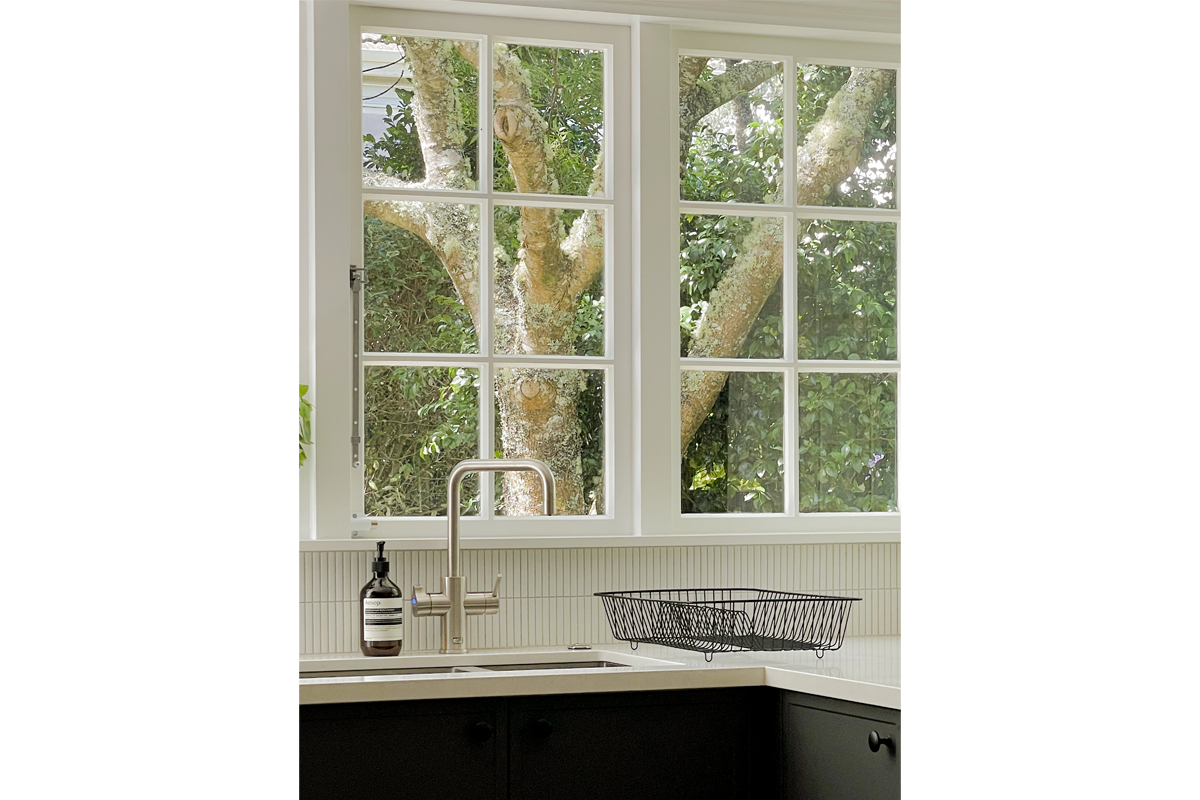
This kitchen is the latest CMID project for a long-term Wellington client. We have been working our way through various rooms of their elegant Karori house, with its handsome dining room already featured on our portfolio page. Our design brief looked to balance a contemporary kitchen within a traditional-looking family home.
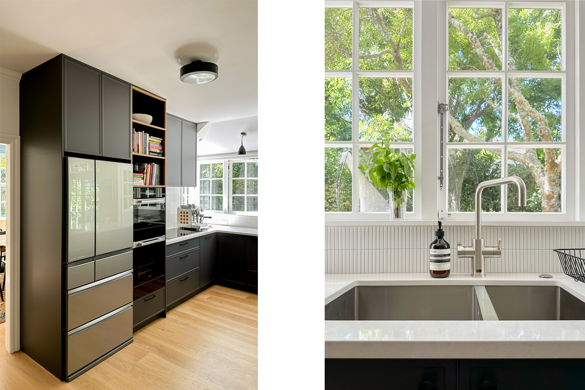
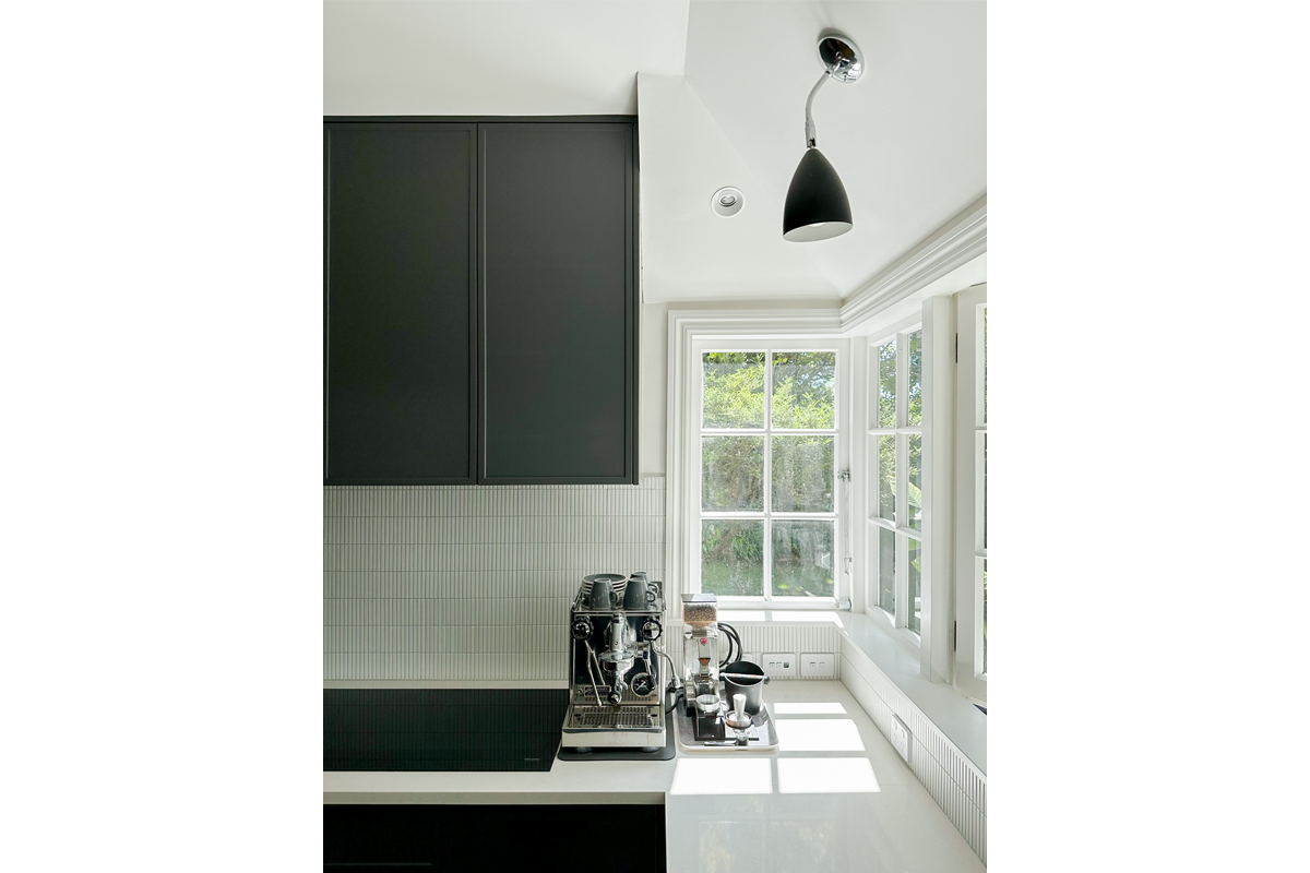
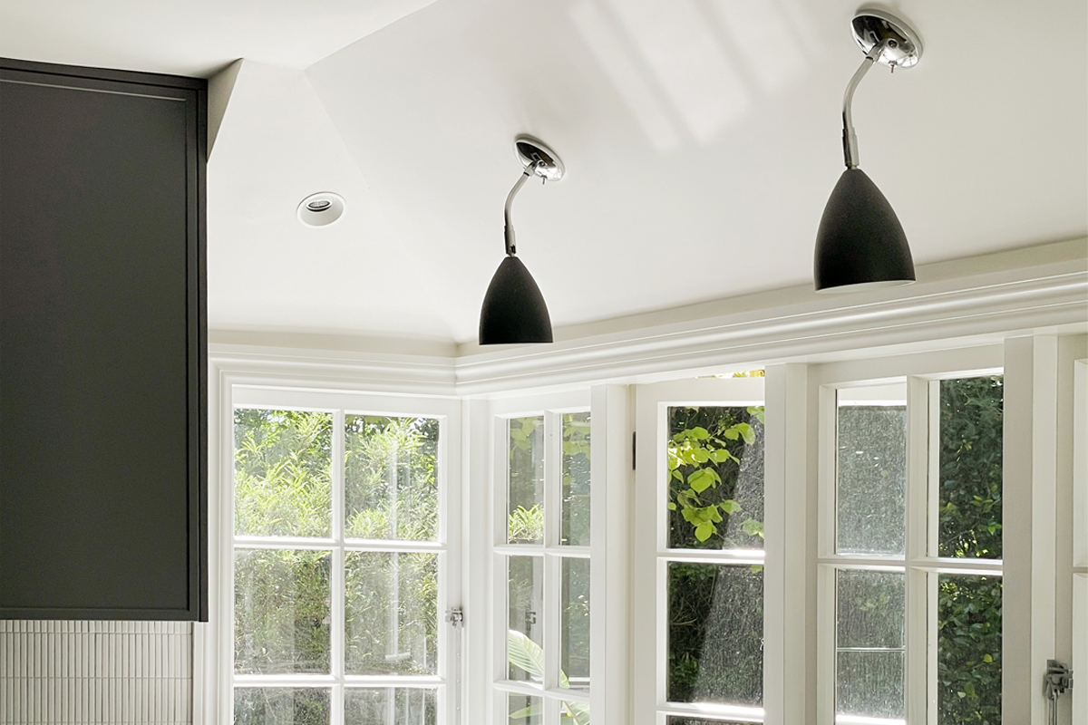
Satisfied that the kitchen was already well-situated within the house – close to the entrance and family room, with an abundance of natural light – we retained its original footprint but sought to improve the its look, feel, and function.
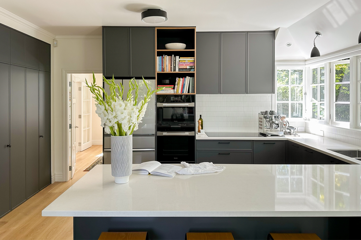
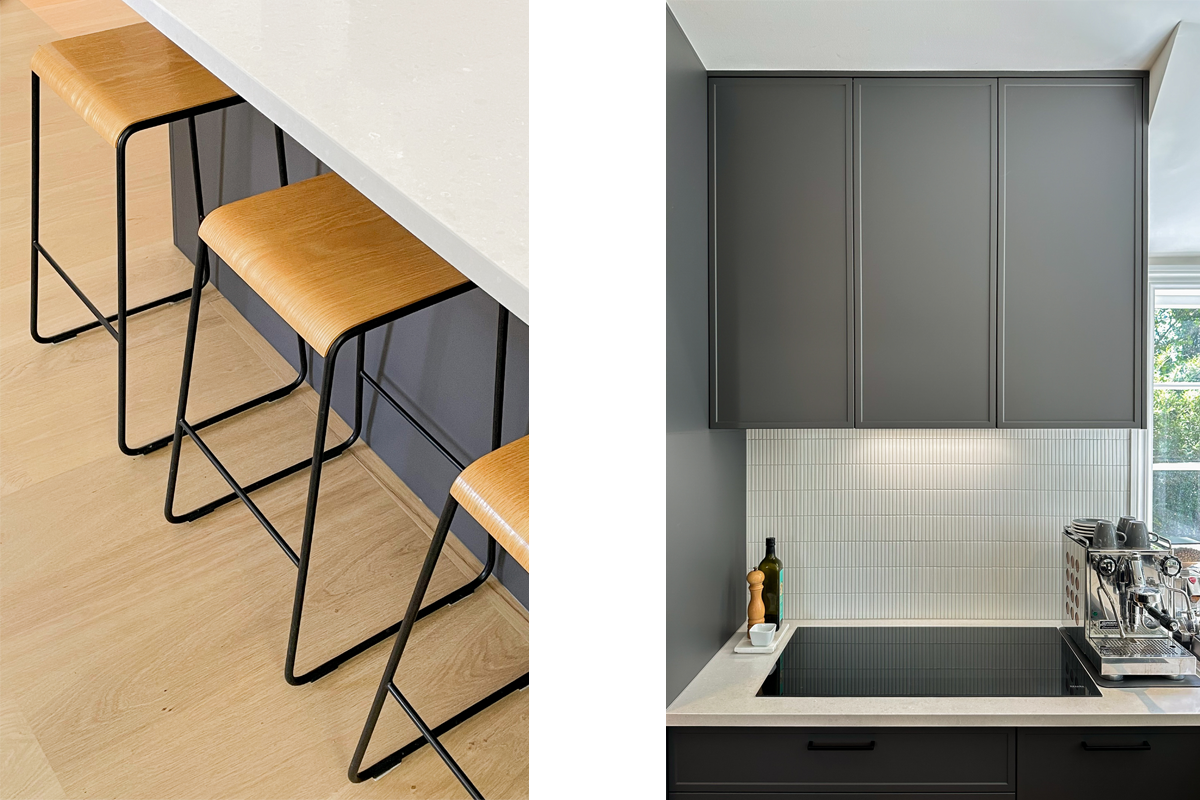
This included applying a dark colour palette. Clients oftentimes resist deeper kitchen colours. In this instance, the complexion of this space helped convey a more spacious and open setting while also playing nicely with the well-lit area.
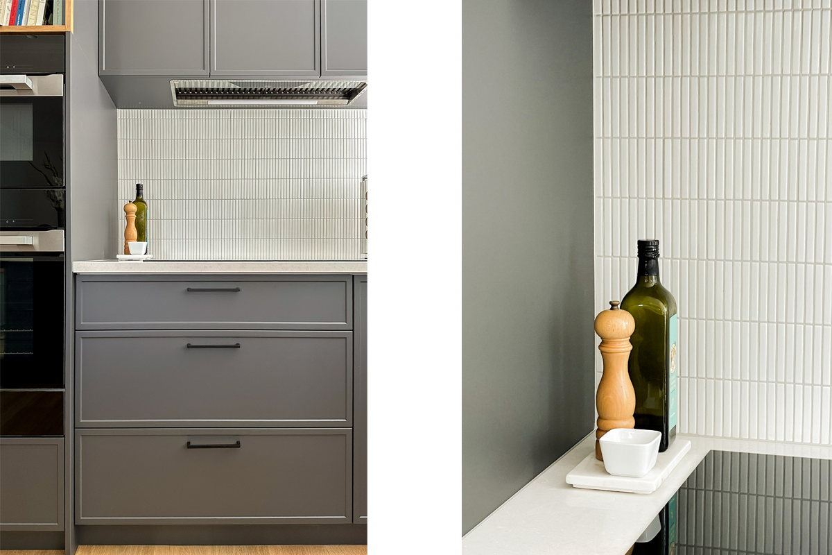
To add further to the cleaner and contemporary look of the kitchen, we had installed modern profile recess cabinets with a slimmer panel at 20mm.
Given its heavy daily use, the kitchen should be a byword for functionality. CMID took this idea forward in designing a kitchen that simply operates better.
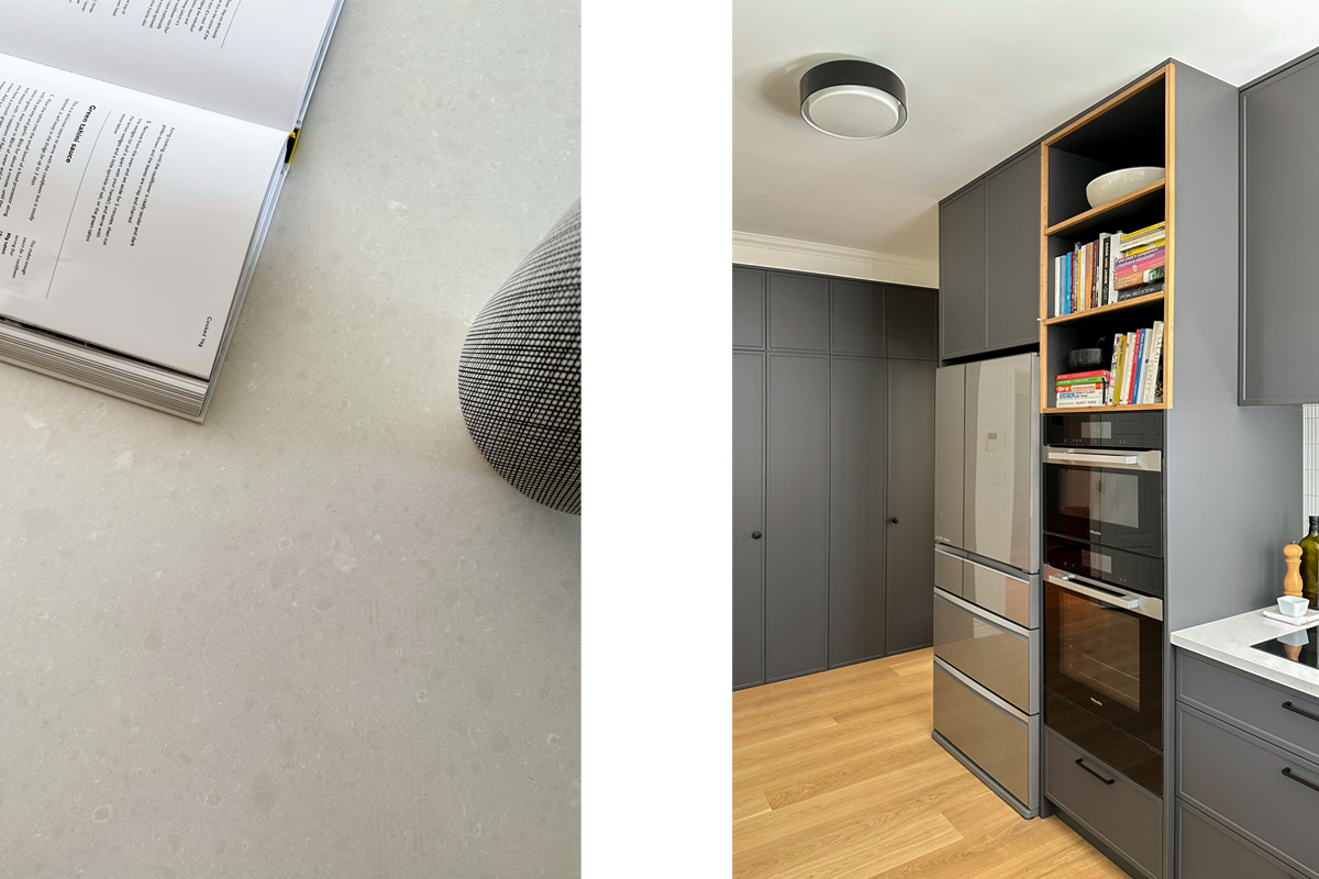
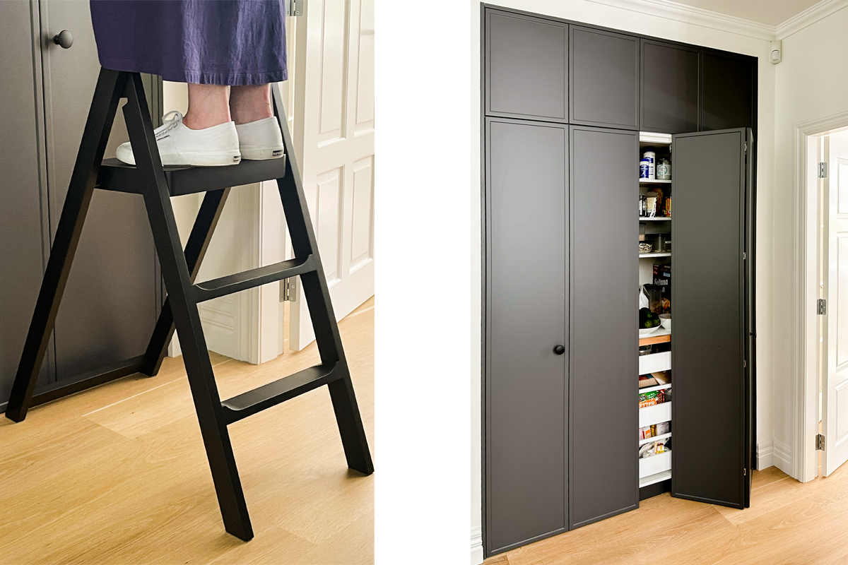
This included relocating the dishwasher and drawers to allow for greater efficiency of space and use. We also expanded the dimensions of the pantry to provide more storage up high, readily accessible by dint of a smart step ladder.
Previously, the kitchen had a circular, bubble-like end to the peninsula. This took up space, so it was squared off for a modern look. It also improved circulation, allowing people to move more easily in and around the space.
